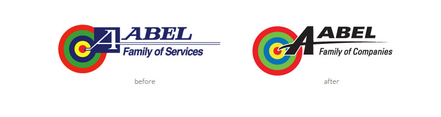
an iconic company – An updated look
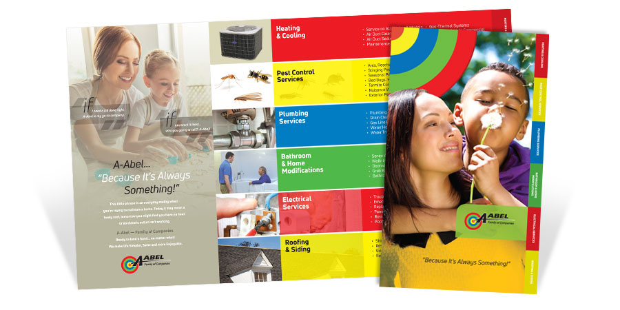
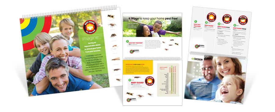
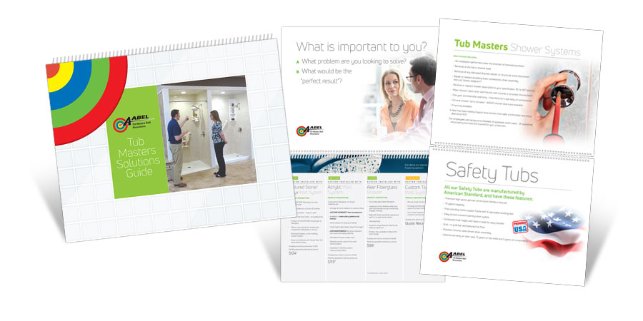
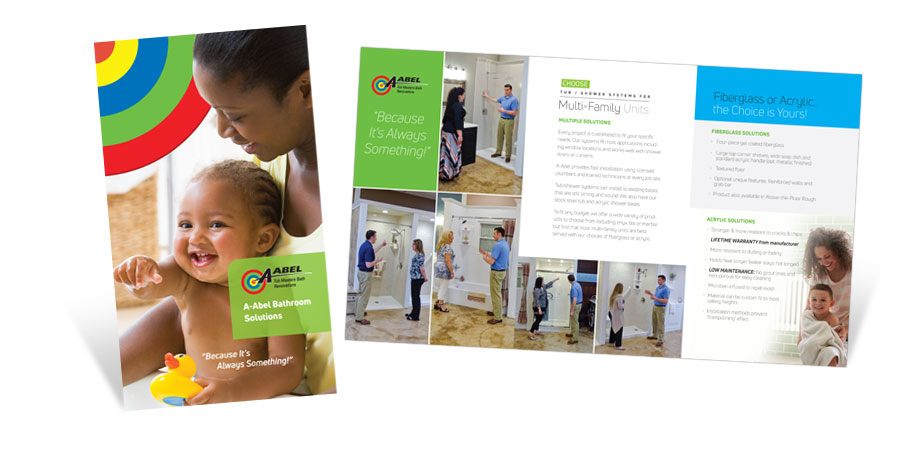
A-Abel. We’ve all seen it. The familiar bullseye – it’s part of Dayton. It’s been around for decades. But the company has evolved. From its humble beginnings as a pest control company, it has grown into a whole family of companies providing heating & cooling, pest control services, plumbing services, bathroom & home modifications, electrical services, and roofing & siding. A-Abel needed a fresh logo with updates subtle enough that older signage could be phased out over time. That’s where Graphic Impact came in. The old serif font was updated. A new sans serif font with a clean, simplified design more accurately projects a modern look. Problem solved.
Not only did they want their logo updated, they wanted to update their brand as well. The following brochures and sales booklets were created to enhance their new look.